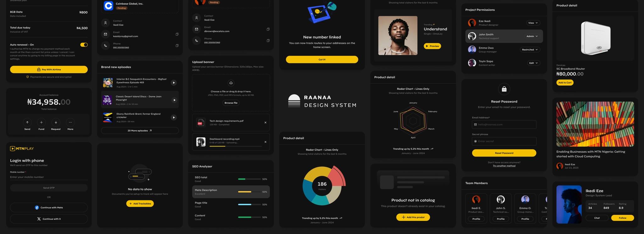
Building Raanaa. A multi-theme Design System for MTNN.
As a major telecom brand with over 150 product teams, 200+ designers, and 800+ developers, we build and maintain dozens of consumer and B2B products used by more than 10 million customers across multiple platforms. Delivering a cohesive and consistent user experience at this scale is incredibly challenging.
To address the growing complexity and fragmentation in our product ecosystem, establishing a strong, scalable design foundation became essential.
Client
MTN, NG 
Timeline
2024 — Present
Team
4 Designers, 3 Developers
Role
Research → Token architecture → Component design → Documentation → Change management
Tools
FigmaZeroheightStorybookTailwind
The tipping point
Over time, our products began to feel like entirely different apps, even within the same ecosystem, across platforms. This fragmentation became more pronounced with every new page, feature, or product we designed.
The absence of clearly defined design principles led to inconsistent decision-making, prolonged discussions, and duplicated effort across teams. Without a shared foundation, valuable time was lost, and the user experience suffered from a lack of predictability, coherence, and trust.
At this point, it became clear that we needed a systematic solution. I championed the idea of building a design system and presented it to the business.
Fortunately, we had gathered ample evidence — from usability issues and productivity inefficiencies to mounting tech/design debt — which helped us make a strong case. The alignment across teams and leadership signaled that the time was right to invest in a scalable, unified design foundation.
At MTN, we believe everyone deserves the benefits of a modern, connected life.
Our strategic intent is to lead digital solutions for Africa's progress.
For the design system team, that means:
•
Make it easier for our designers and developers to design and build faster, smarter, and more inclusive solutions for the millions we serve.
The design system itself is key to achieving this by providing guidelines, component libraries, technical documentation, services, tools, and education to enable product teams across the company to build high-quality products more efficiently.
Our Approach: From Chaos to Cohesion..
Building a design system at this scale came with a unique set of challenges and a set of foundational questions we needed to answer early on. Here's how we approached it:
Taking Inventory: Facing the Mess
We began by conducting a comprehensive audit of all live products to identify reusable components, design patterns, and inconsistencies. This helped us understand the current landscape and what needed to change.
We opened up every Figma file we had, one by one, reviewing designs from different teams and products, pulling out components, UI patterns, and reusable bits and pieces, and collected them all in one place.
Good patterns were buried under layers of inconsistency. We used that insight to map out what we had, what was missing, and what needed to be rebuilt from scratch.
We documented all the findings in a shared sheet, which helped prioritize what we needed to build first.

Laying the Foundation: Tokens & Naming
Next came the part I was most excited about — defining the foundational elements: colors, typography, spacing, grid, and animation. I knew that without a strong foundation, the whole system would crumble.
 Create a scalable typography scale for mobile & desktop
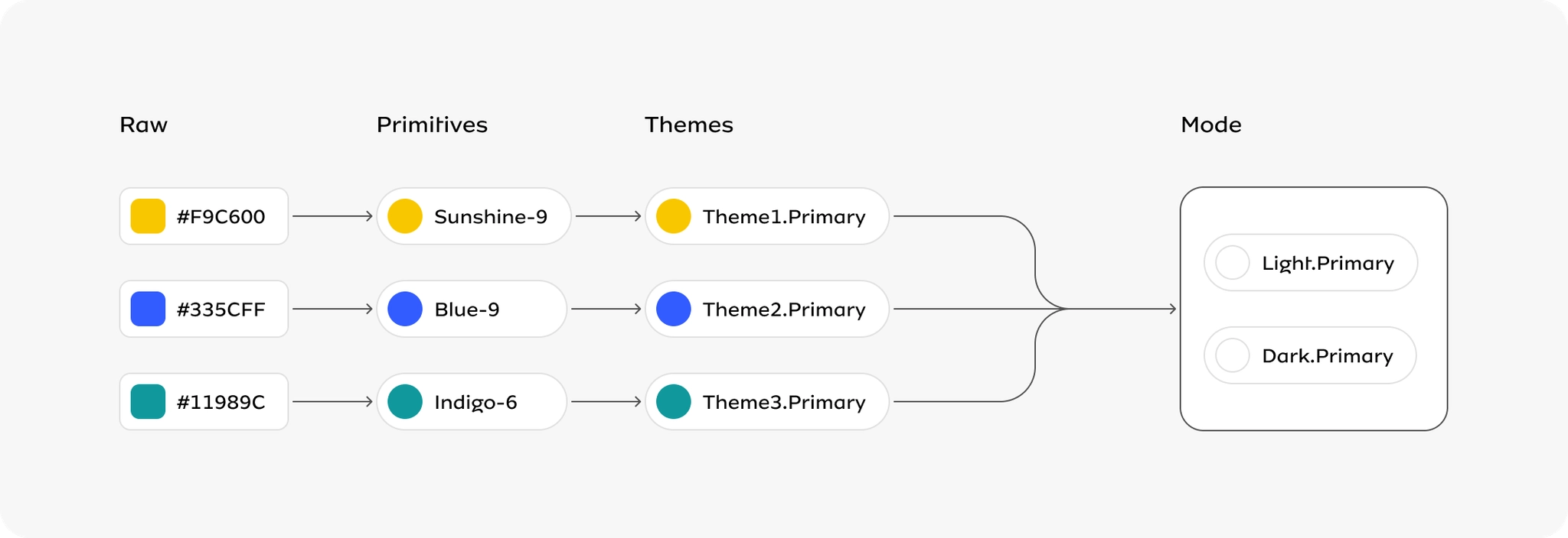
 Create accessible color system for multi-theme support
 Create a spacing baseline for use across all products
It wasn't easy — there were a lot of iterations, and even more research. I went through several public design systems, studying how other teams tackled these challenges. While I picked up a lot, the real work was adapting those learnings to our unique context.
During my research, I found a strong direction that balanced flexibility, scalability, and simplicity, but required a lot of effort to use with our semantic token needs. This gave us a solid foundation that matched our brand requirements while remaining extensible.
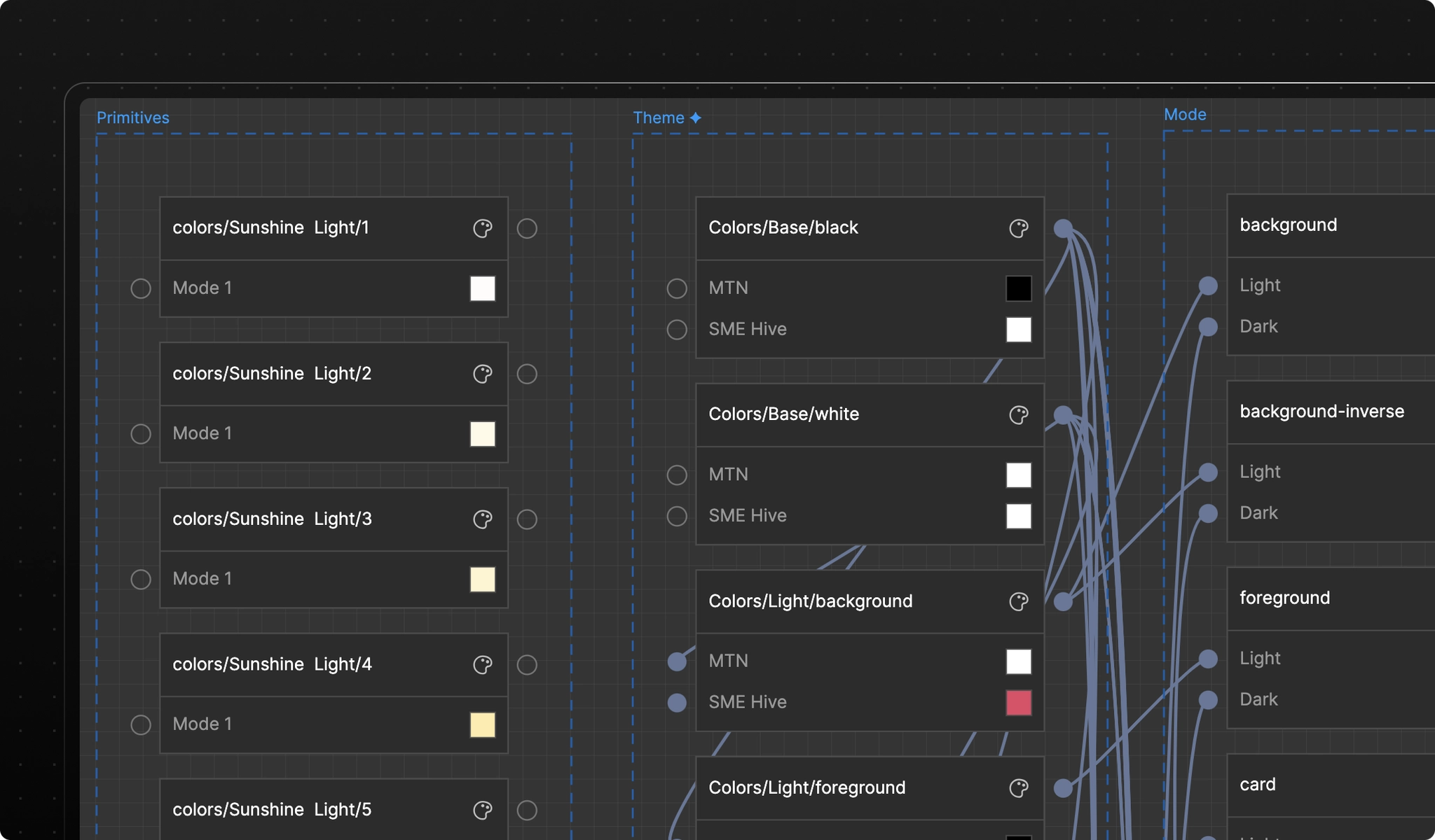
Tokens → Colours
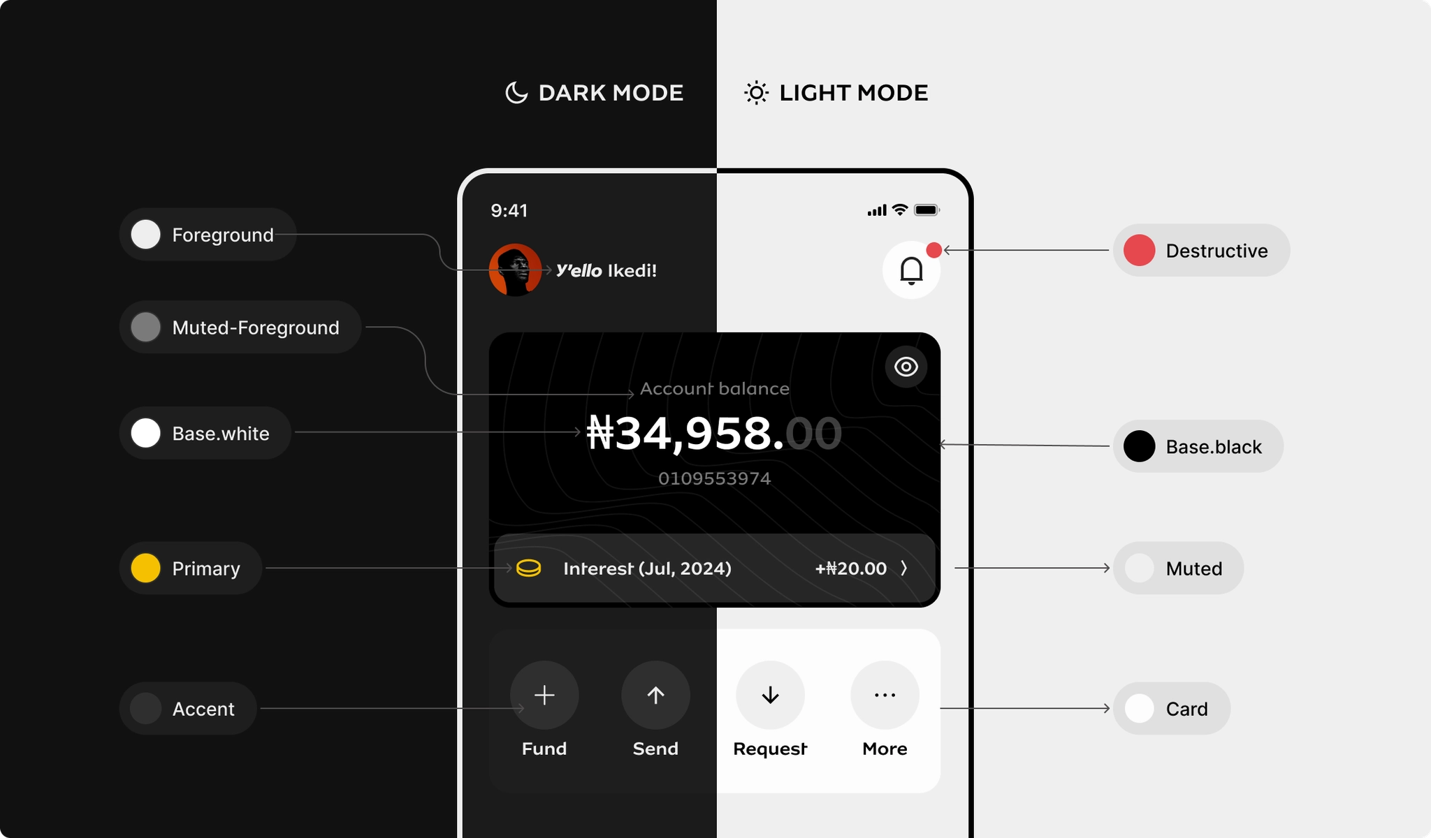
Created an accessible color system supporting multiple themes — MTN's signature yellow, alongside dark mode and high-contrast variants. Semantic tokens mapped to intent, not aesthetics.
Tokens → Spacing
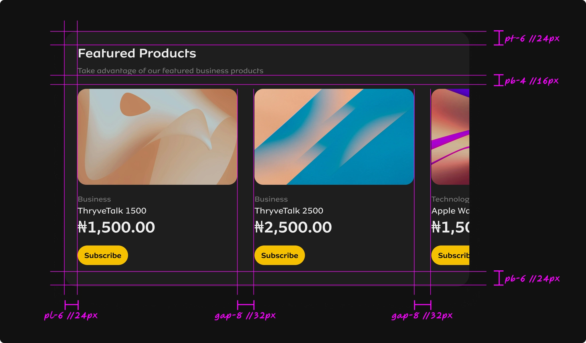
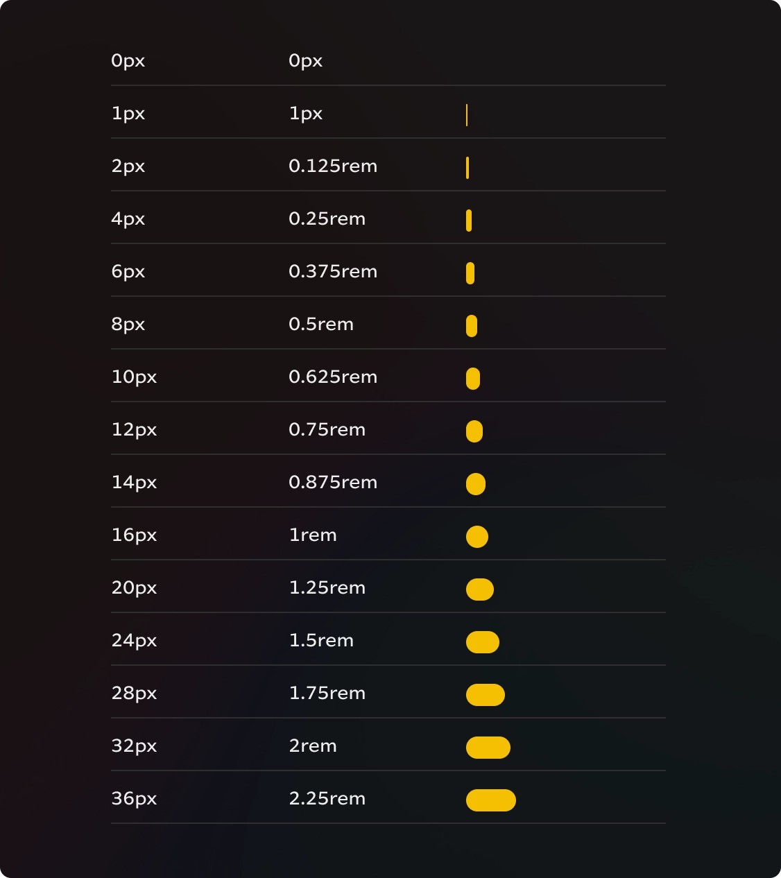
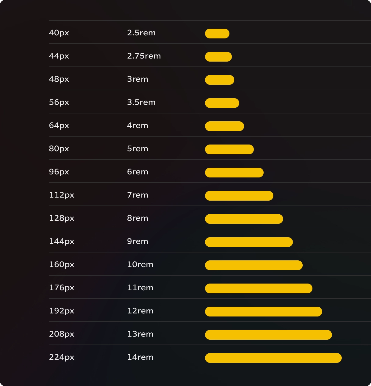
To make things simple and understandable, we used a numerical scale that matches Tailwind's number scale. This allowed us to build with a spacing system we were already used to, also making the handoff to developers seamless.
Tokens → Typescale
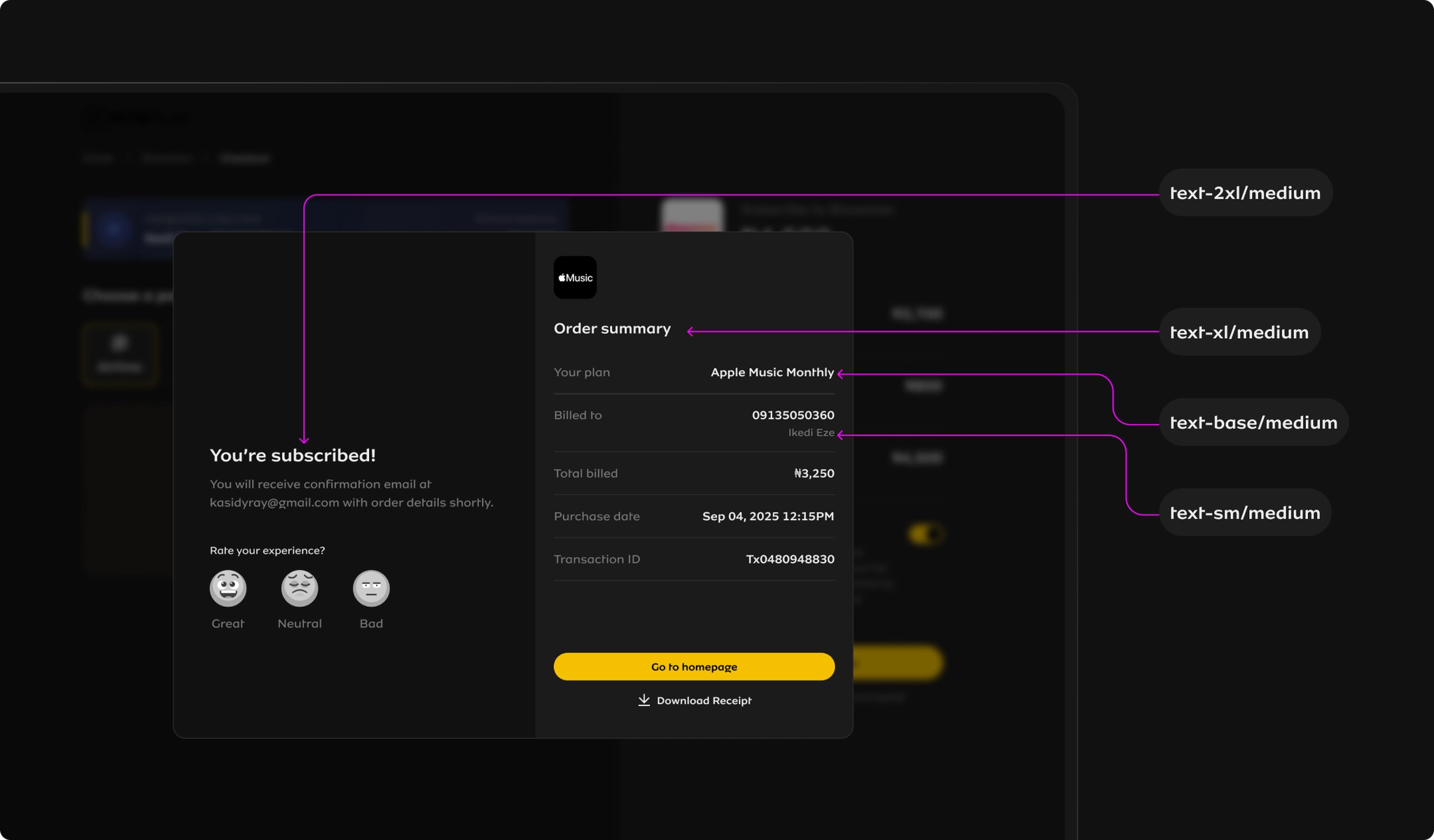
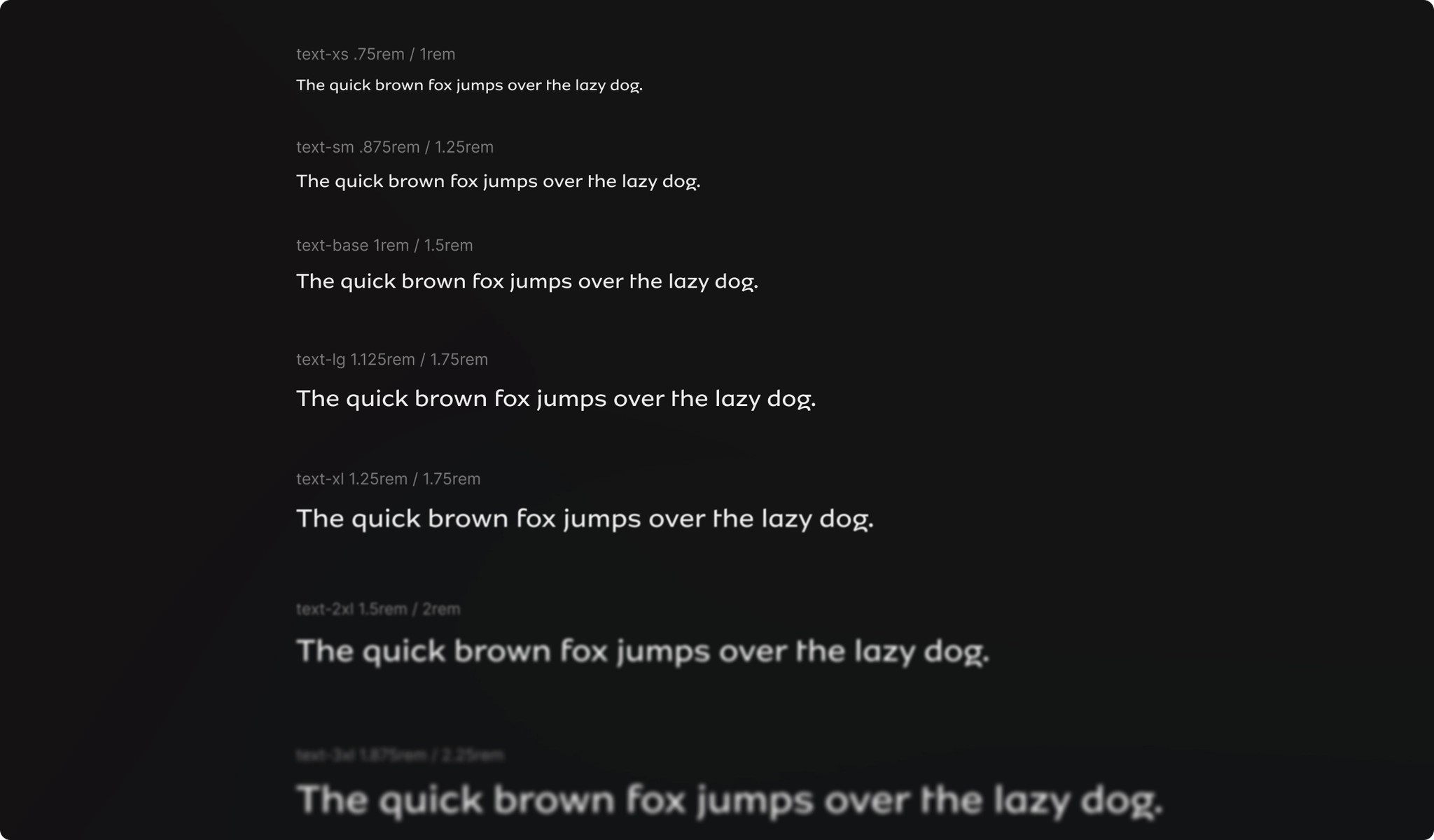
For the type scale, we maintained Tailwind's typography scale while customising it for our brand — ensuring readability across all device sizes and contexts.
Create Core Components
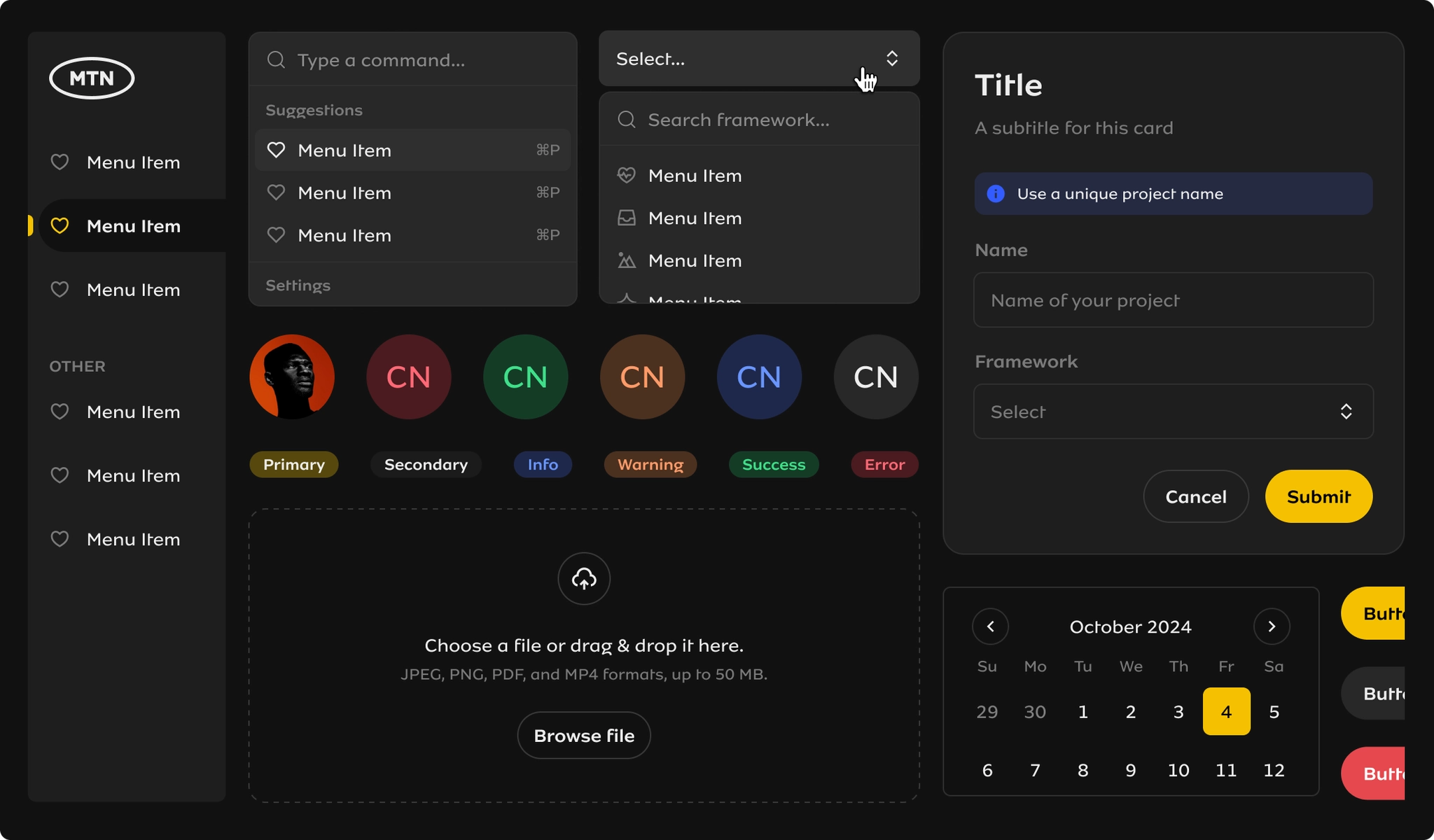
Creating components for a design system is an art. A component embodies design intent and development alignment. A design system component is expected to match 1:1 on Figma and code. This requires care and tight collaboration between design and dev to align on behaviour and constraints.
Responsive & flexible. Components had to be responsive, built with Auto Layout, and set with the right constraints and resizing rules.
Dynamic props. Use of props to make components more dynamic — swappable icons, conditional content, and multiple states.
In-context documentation. I made sure to document every component — what it's for, when to use it, and things to watch out for.
Interactive prototypes. Using Figma's prototyping tools, I built interactive components to simulate user behavior — hover states, focus rings, and transitions.
Organized with intention. Everything was grouped, named, and organized with intention. This wasn't just about neat files — it was about making the system discoverable.
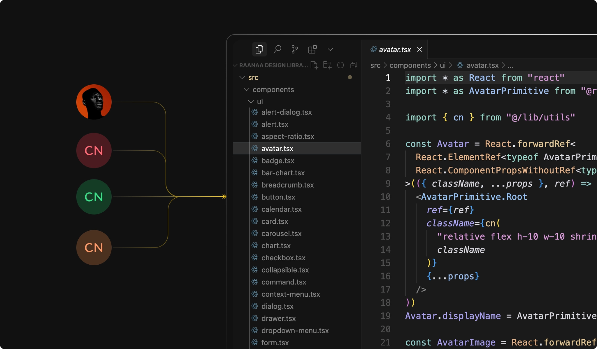
Implement in Code
Design and engineering worked closely to implement components in codebases across platforms.
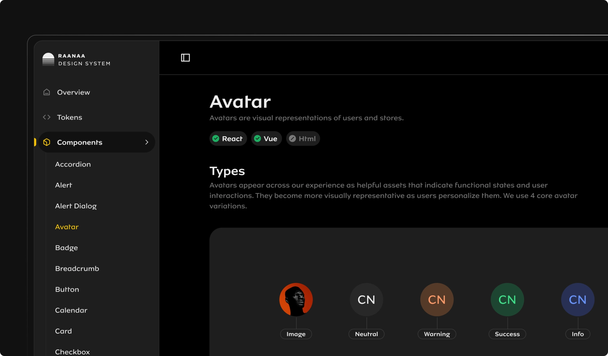
Document Everything
We documented everything using Figma and Zeroheight. Figma was great for in-context notes right where designers worked, while Zeroheight gave us a clean, searchable home for the full system — tokens, components, props, usage guidelines, and more. It became our single source of truth.
This step helped transform the system from "a bunch of well-made components" into a living, breathing product the whole org could use with confidence.
Create Patterns, Templates, and Blocks
Beyond atomic components, we created higher-order design patterns, layout templates, and composable blocks that product teams could assemble into full experiences.
Launch and Evangelize the System
It turns out that building the system was the easy part. Getting people to actually use it — that was a different story.
Here's what we did to encourage adoption:
•
1:1s for informal feedback and to create backchannels across teams.
•
Office hours to demo in-progress work and get hands-on feedback.
•
Async design reviews to understand how the system was being used and spot friction points.
•
Establishing active support channels to ensure our feedback loop is maintained.
•
Finding champions — especially on the dev side — to ensure the system is embedded in both design and code.
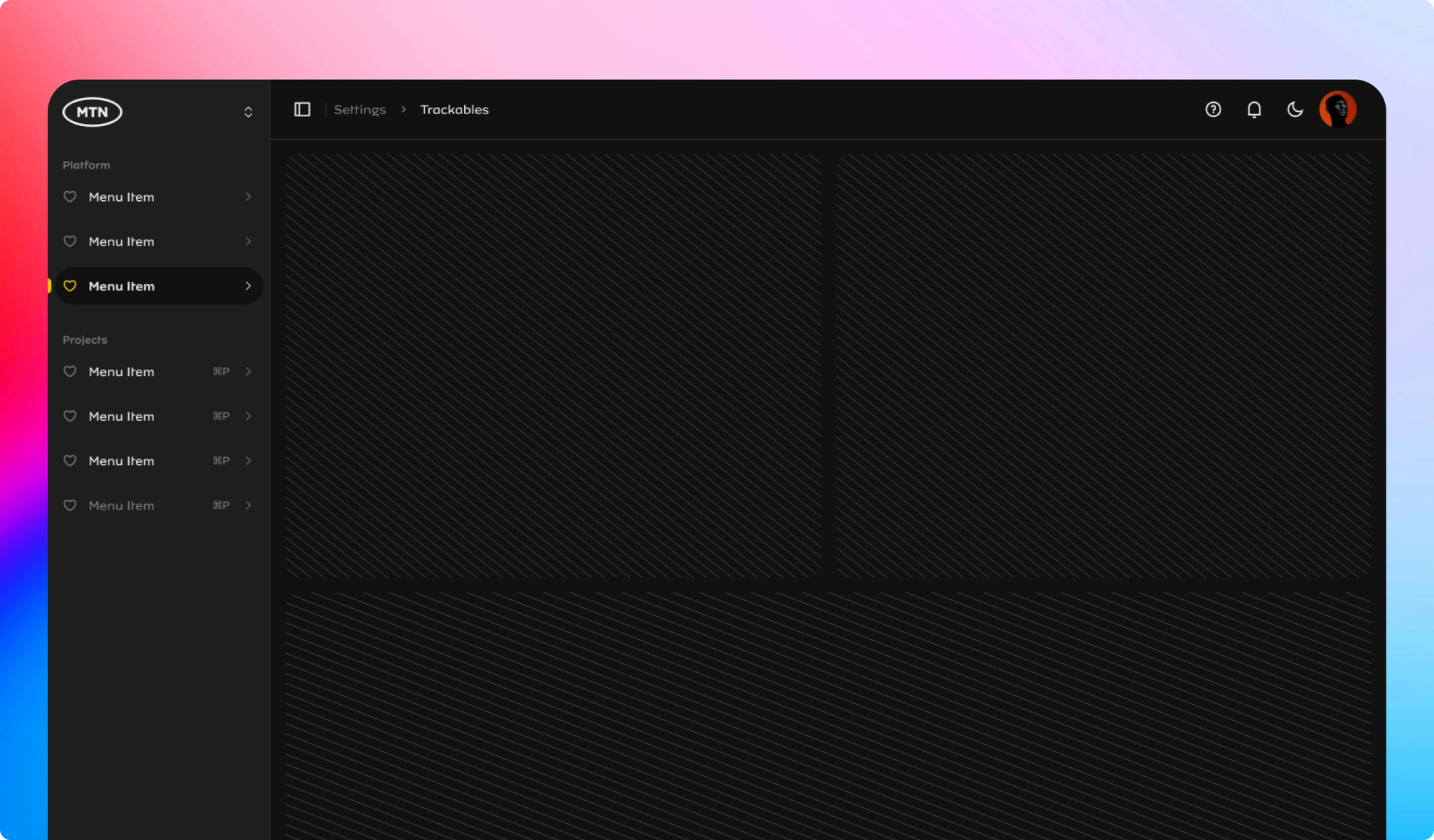
How This Helped MTN and Our Stakeholders
 +92%
+92%Brand Consistency
We achieved consistent branding across new products, improving overall user trust and perception.
 −40%
−40%Developer Experience
Quicker design workflows, easier collaboration, and smoother onboarding for new team members.
 78%
78%Component Reuse
Designers shipped screens faster using pre-built, documented components.
 150+
150+Teams Onboarded
Product teams onboarded within the first year of launch.
Here are some lessons I've learned
Building a design system at scale teaches you a lot. Here are some key takeaways:
1.
Start messy, move fast.
Waiting for perfection slows you down. Progress beats perfection — especially early on.
2.
V1 will break — and that's fine.
Your first version is just a launchpad. Expect to evolve.
3.
People > Components.
Adoption only happens when teams feel included. Education and communication are just as important as the system itself.
4.
Docs matter.
Good documentation keeps everyone aligned. Zeroheight helped us scale that clarity.
5.
Bring everyone along.
Involving others early builds ownership. The system gets better, and adoption feels like a win for everyone.
Next Project
02
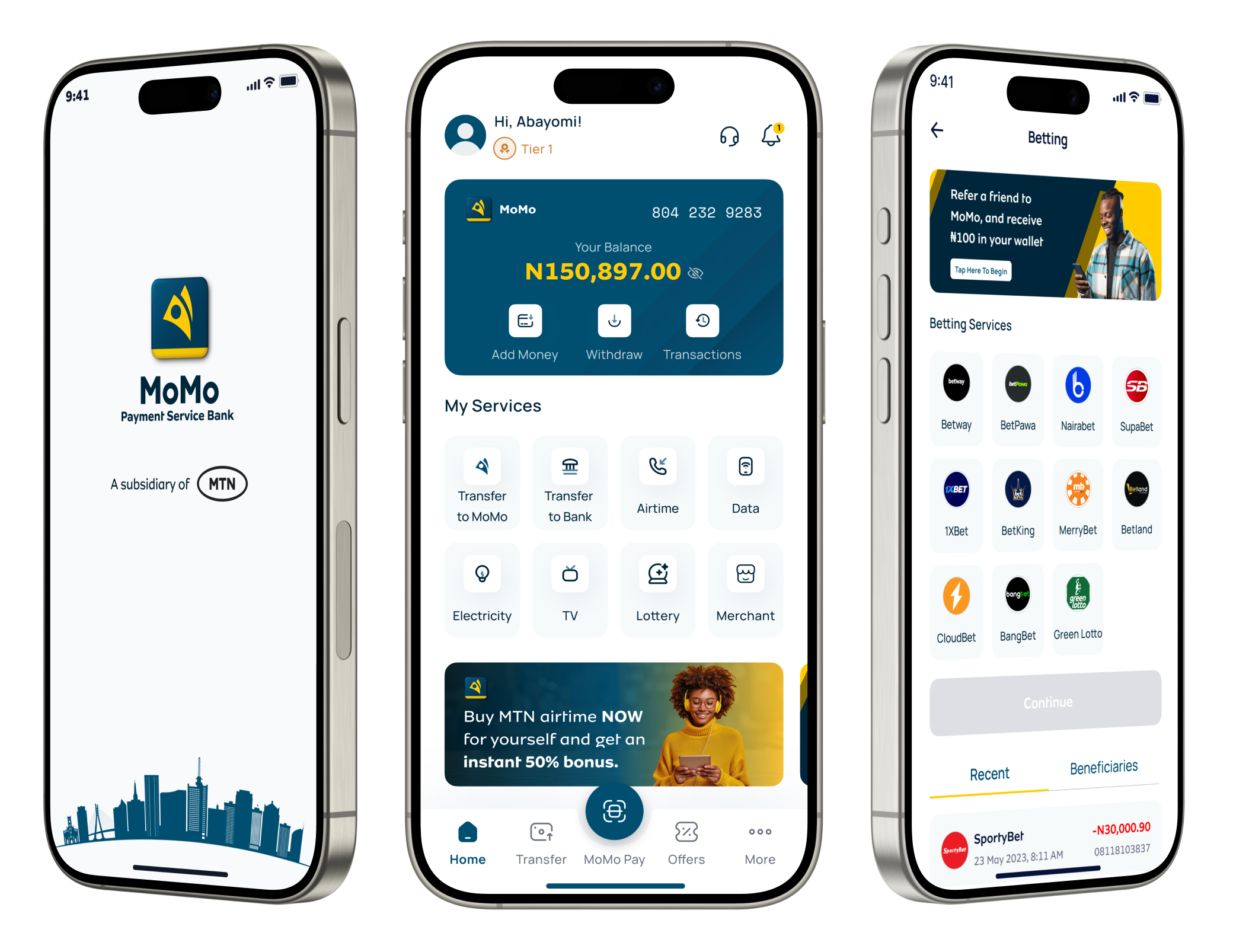
Redesign Of the MoMo PSB Mobile Application
MoMo PSB (MTN) · UI/UX Designer
Interested in working together?
I'm currently available for new projects and collaborations.